A well-proportioned shopfront takes its lines from the building above, keeps the fascia to about a fifth of the frontage height, stands the glass on a stallriser of about 450mm to 600mm, and lines up its mullions and door head. The aim is a calm frame around a bright display. With those proportions right, modest materials can still look expensive.
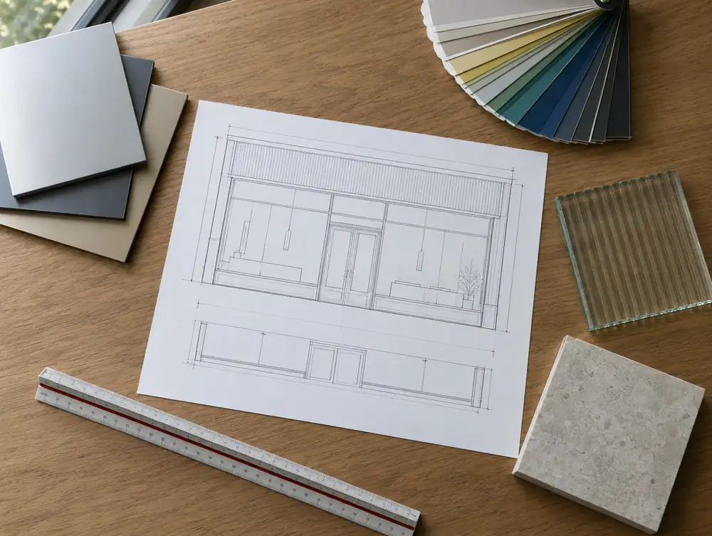
What makes a shopfront look right?
A shopfront looks right when it belongs to the building above it. Stand across the road and look at the whole elevation: the upper windows, the piers between them and the line of the first-floor cills are already telling you where the verticals and the top of the fascia want to go.
Good fronts have three clear zones. A solid base gives the glass something to stand on, a large glazed middle does the selling, and a slim band at the top carries the name. Take away any one of them and the eye starts to feel something is wrong, even if it can't say what.
The figures below are starting points, and a good designer will break them for a reason. Treat them as a way of testing a drawing. If your fascia comes out at a third of the height, you have probably let the ceiling inside the shop make a design decision for you.
| Element | Starting point | Why it matters |
|---|---|---|
| Fascia depth | About a fifth of pavement-to-fascia height | Keeps the name from dominating the building |
| Stallriser | 450mm to 600mm | Gives the glass a base and protects it |
| Letter height | About 60% of fascia depth | Leaves margin above and below |
| Frame sightline | Around 50mm in aluminium | More glass, lighter look |
| Pane shape | Taller than wide | Echoes the windows above |
How deep should a shop fascia be?
A fascia should usually be about a fifth of the height from pavement to fascia top, and it should stop below the first-floor cills. That tends to mean 400mm to 600mm on a typical two-storey parade. Deeper boards almost always exist to hide something, and the honest fix is to deal with the thing being hidden.
Usually that something is a suspended ceiling running hard up to the glass. Stepping the ceiling up or back behind the window, with a short bulkhead, lets the fascia return to its proper depth and gives the display more height. Old shutter boxes are the other culprit, so check what is actually in the void before drawing around it.
A slight forward tilt can help a fascia read from the pavement and keeps the top edge crisp. Traditional fronts did this with a sloped board under the cornice, and it does a surprising amount for legibility when you stand close to the building.
How should the glass be divided?
Divide the glass so that its verticals pick up the piers and windows above, with panes taller than they are wide. One huge sheet can work on a modern building, but on most older elevations a mullion on the right line gives the frontage a rhythm the rest of the facade already has.
An odd number of bays usually feels more settled than an even one, since it avoids a dividing line at dead centre. Sightlines matter here too. Dropping from a 75mm frame to 50mm across five verticals gives back 125mm of glass, and the frontage reads as lighter.
Look hard at the glass line, meaning how far the glass sits back from the face of the pilasters. A shopfront with 100mm of reveal has shadow and depth. Glass set flush with the wall looks flat, particularly in bright side light, and a small setback costs almost nothing on a new frame.
Where should a shop door go?
Put the door where the building and the plan both want it, which is usually either central on a symmetrical front or to one side on a narrow unit. A side door leaves one long uninterrupted window, and that suits a fashion or homeware display. Centring it gives two shorter windows and a formal, balanced look that many jewellers and restaurants prefer.
Setting the door back also buys you a sheltered threshold and a little more window, and the leaf can swing clear of the footway. Allow for a 1500 x 1500mm landing, which is the entrance figure in all four nations. Keep the door head on the same line as the transom so a single horizontal runs across the whole front.
Draw the door at the same time as the sign. A logo centred over a door that isn't centred on the fascia is a small error that everyone can feel.
How do materials and colour work together?
Limit a frontage to two or three materials and let one of them lead. Dark frames recede and make the interior look brighter from outside, which is why deep greens, blue-blacks and bronzes work so well on a shop. Pale frames sit forward and read more strongly than the glass, so they need more careful drawing.
Colour should relate to the stone or brick above. A warm red brick can take a green or an off-black, while Portland stone can look cold beside pure black. Check your sample outdoors at two times of day, because powder-coat and paint swatches both shift between a north light and the afternoon sun.
How does evening light change a shopfront?
After dark a shopfront inverts: the frame goes dark and the interior becomes the display. In daytime the street is usually brighter than the shop, so glass reflects the pavement and the buildings opposite, and only strong internal lighting pulls the eye through it. A deep reveal or a canopy helps by shading the glass.
At dusk the balance flips, and that is when a shop gets noticed by people walking home. Warm white at around 2700K to 3000K suits most food, fashion and hospitality interiors. Aim the light at the merchandise and walls, because a grid of bright ceiling panels will be reflected in the glass and is all anyone sees from the road.
Halo letters on a dark fascia, a soft wash on the stallriser and a lit lobby soffit will do more for a front than extra brightness. Think of lighting as drawing the edges of the design.
Common questions
Should I follow my brand guidelines exactly?
Follow the spirit, then adapt to the building. Brand manuals are usually drawn for a generic unit, and most landlords and councils will expect the fascia depth and sign size to respond to the actual elevation.
How can I judge a design before it is made?
Print the sign at full size on paper and tape it to the fascia, then cross the road and look. It takes an hour, costs almost nothing, and shows up mistakes in letter height that a drawing hides.
How can a narrow shop look wider?
Keep the frame slim, run the glass as one bay, and put the door to one side. Stopping the fascia cleanly at the pilasters also helps, as a front that respects its edges looks deliberate at any width.
Do I need a designer for a small shopfront?
A small front benefits from drawing as much as a large one, because there is less room to hide errors. Our design service is £495 to £2,495 plus VAT per frontage, and scale drawings come before anything is made.